This year's MFA show really impressed me due to the fact that it diffidently had a different composition than the past ones I have looked through. This year's seemed to have larger, more concise rooms and set ups as opposed the intricate smaller and more concise set up. All in all I would say that this set up made the show look like it contained generally larger images and pieces.
I was immediately drawn to the boars head that spews blood as i entered the gallery. First, the noise was very attractive, aside from the fact that it is a god damn boar's head spewing blood, Ha Ha. It was very reminiscent of imagery used in Lord of the Flies, where kids take over an island and anarchy results. It is also very closely related to some of the imagery in Saw, where a mask of pig head is used to frighten people.
I also really responded to the blood stains that amassed around the bottom of the of the bucket. I felt that this not only created some nice gruesome imagery that could get on your shoes, but also something about it made it seem like the instillation was part of the room, more-so than the others. Now the piece was interacting with its ground, instead of just standing on it and it was this fact that made me continuously pace around it, searching for something to smear, touch, or get on my shoe.
Another thing I really liked about this show was the rainbow room to the left of the gallery when you walk in. Not only did it remind me of some old 80's cartoons, but it was generally an impressive, immense work to take in, as it had reached all the way up the wall. These drawings responded with me not only because they were done in a gaudy, colorful palette, but also because of the expertly rendered anatomy, clothing and drapery, and hair. The way that these aspects, particularly the flowing hair, are rendered in an old masters-esc way combined with a cartoon, colorful, gleeful way just goes to show you that the artist was trying to combine two separate styles of art into one communicable way. All in all this show really impressed me and made me look forward to our show next spring.
Thursday, December 9, 2010
Sunday, November 28, 2010
Studio Journal 5
Here are some pages of a Diary comic that I worked on for a class.
I tried to emphasize an extremely linear stroyline composition that has two strands. One is a pictoral representation of the days while the other is an abstract representation of what those feelings were like. i tried to make it appear to all be one line to show how the days moved in my mind.
Studio Journal 4
Recently I have been working on some shots for my film piece that would be used as the opening credits. They consist primarily of nature scenes mixed with pieces of broken down architecture and industrial works.
For instance, I shot a broken down gate with stumps protruding out of it as-well as windows broken from ivy growth and foliage. I am trying to emphasize the setting with these shots, basically trying to summarize the world that now exists for the characters. I want to use these simple ideas to illustrate the point of overgrowth and how nature can topple and grow within a deescalate, barren landscape. I plan on continuing with these types of shooting schedules as well as planning for some actual acting and scene shooting in the near future.
I am having trouble uploading a scene I shot from a while back that I plan on reshooting.
Sunday, November 7, 2010
Studio Journal 3
Here is my first draft of my proposal. I most certainly expect to be editing it upon review of some of my peers:
For my thesis I want to compose a film piece with a comic companion piece. This would mean that I would be creating a film, and then drawing the panels and deciding the composition after the film is completed. This would be in contrast to the normal process, which usually consists of the comic being done first. I feel like this process will give me the model lie quality that accompanies realistically drawn figures and settings.
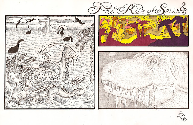
And here is another comic that I had worked on for my Graphic Narrative class. it is a demonstration of a simple anecdote. I wanted to mess around with the subtleties of pencil vs. pen vs. ink and some stuff in between. I was really pleased with the way the animals were rendered, not only in the close -ups (which is usually easier to accomplish) but also at a distance. All in all I was very pleased with this work and was happy with this homage to Fantasia's Rite of Spring segment.
For my thesis I want to compose a film piece with a comic companion piece. This would mean that I would be creating a film, and then drawing the panels and deciding the composition after the film is completed. This would be in contrast to the normal process, which usually consists of the comic being done first. I feel like this process will give me the model lie quality that accompanies realistically drawn figures and settings.
The piece would be heavily narrative and would consist of being roughly a post- apocalyptic western. I am also planning on using my brother’s band to compose a multitude of original pieces to provide a strong score. Seeing as how this is very typical of the spaghetti westerns that I am trying to emulate, this will be a satisfying and appropriate measure. I will also be attempting to do all special effects in camera and desperately avoid using any after effects. I feel that this will aid in the homemade, gritty feel that I would like to shoot for.
The palette that I want to incorporate would be that of organic tones, like green, grays, reds, yellows and browns in order to emphasize the feel of natures overpowering force. This palette will also give the feel of the seasons and how they affect the environment outside, as well as how people begin to act through them. I feel that this composition will also be easily transferable to the pencil gradient that I will be doing the graphic work in.
All in all I feel that the film and comic media allow for an easy transfer from page to picture screen. The easy thing about the transfer is that the shots can be easily transferred to panels. This could be viewed as being backwards to the normal process, seeing as how it would look like I am using the shots as a story board for the comic but in actuality I would like to use simple panels to compose the shots and then transfer it beck to the page when I have lined up my reference (the shot that is). This process will be tedious and will probable get repetitive, but such usually the case in drawing and film, so this will be nothing new.
And here is another comic that I had worked on for my Graphic Narrative class. it is a demonstration of a simple anecdote. I wanted to mess around with the subtleties of pencil vs. pen vs. ink and some stuff in between. I was really pleased with the way the animals were rendered, not only in the close -ups (which is usually easier to accomplish) but also at a distance. All in all I was very pleased with this work and was happy with this homage to Fantasia's Rite of Spring segment.
Sunday, October 17, 2010
Studio Journal 2
For this installment of the studio journal i thought hat i would display my recent work in the comic media that shows an understanding of space, not only within but around the panels as well. Here are some shorter comics that showcase what I have been working on lately.
and the second page
The narrative of the comic, though vague, is executed using the visuals more so than the words on the page. The basic gist is to explore the idea of space travel and dreams. The color is specifically used used to show the difference of these two topics.
These two pages also utilize the age old technique of symmetry within the pages. I also tried to incorporate symmetry within the individual panel compositions, thus reiterating the idea of the conditioning and the dreamlike aspect of the piece. The black gutters on the page also aid in the idea of space, as well as a dream.
Here is another comic that I did recently that was intended to e a simple narrative. Situation, setup, conflict, denouement. It is executed in the simplest way and in a strictly visual way. Just a simple attempt a humor and an exercise in spacial studies and blocking.
Thursday, September 30, 2010
Studio Journal 1
Here are some sketches of my roommates, the people who
will be playing the roles in my movie and
thusly the models for the illustrations.
I wanted to incorporate elements of realism through the idea of actually using the models, and I feel that it would be just as appropriate to conduct the sittings in a filmmaking aspect. This will also allow for easy model drawings, seeing as it will not be any trouble to have the models in front of me.
I also plan to incorporate all practical effects (such as blood work, gun props, and all other aspects of the shooting process). This will aid me being able to render the action and unconventional scenes realistically.
Monday, September 20, 2010
WLCM BCK 2010
This week we viewed the show at the Mason Gross gallery, which was essentially a welcome back show for the faculty, grad students, and a few separate exhibits that encompass a wide variety of medias. Seeing as how the show has no specific theme to the entire show, it is quite striking how the works accent each other and compliment each other, and even seem to create slight themes betwixt themselves.
The first area that I thought was very compelling, visually and emotionally, was the extravagant room of Lyda Craig. Looking immediately to the right of the room, you notice a portrait done in pastel on paper. This is her "Self-Portrait (in studio) (1997)" and it is of striking resemblance of many old portraiture paintings. Medium shot, very classic composition. There also exists beautiful crosshatching and flourishes that add to the overall gesture and background of the piece. Then you move down the wall and find the sketchbook of sketchbooks. This delicate book is riddled with tribal renderings and spot on figures, reminiscent of all those old masters (and in this I mean people like Da Vinci, Michalangelo, to Durrer and such). Just take a look at these pages to the left. They are obviously done with live models, possibly because such is the way it needs to be done to get that absolute true motion and feel of another person in a drawing. These sketches are so beautifully paired to the portrait and other paintings and such that riddle the room. Such as Raphael had hundreds of studies of body and figure before embarking on his School of Athens, Lyda displays her studies of her concepts that you can find in her paintings and portrait work. This brown sketchbook is FULL of portrait work, studies, paintings of landscape, colored pencil experiments in color, and pencil renderings of what appear to be tiny trinkets. All in all i spent most of the time in this room and truth be told I was probably most concerned about this room and particularly these works. Also I thoroughly enjoyed the diptych like portrait paintings of the grandparents and the studies that accompanied them.
The next area that i became fond of in my trek about the rooms was the New Grey by Shane Whilden. this digital print provides an interesting landscape executed in a very futuristic like vision. It is broken into small strips of color that blend together to appear maroon or reddish from afar. The Lanscape (looking very much like 2001's stargate landscape sequence) is broken into about three planes that recede into red, but the interesting thing is all levels of the landscape appear to include the same colors, just in variation. The landscape, painted like quality of this photograph is quite daunting and possibly and homage to old western landscape paintings.
This piece i feel could be paired with the sculpture by Patrick- Strezelec Syn in 2010. This cast aluminum, limestone, stainless steel peice is obnoxious and green and might compliment the reddish of the landscape. Although that might take away from its wonderful placement i the gallery. Also I might have not been able to sit next to it whils we spoke in their and thusly i might not like it at much as i do. Sitting around it I envisioned multiple layers and pedestals that could could be stood upon, like an Escher drawing, or one of the Inception movie posters. The peice had an overall circular shape, yet seemed to defy gravity at points with its leaning and balancing act. I found these futuristic pieces very science fiction like and interesting on the whole and also i thought that they gave a good balance to the classical work that much of the show displayed.
This show, in my opinion, was an excellent way to reintroduce us to the gallery. The set up was classy, the art was grand, and there was a lot of things fot us to choose from. Many works like the Insulate work, the paintings that stood upright, Rapheal's work and its awkward placement, and even the text font placement of the show title worked to the advantage of the show and really made the show a top notch display of the talent that the artists involved hold.
Thursday, September 16, 2010
Interview with Jeff
Today i got to sit down with Jeff from our thesis class and got to interview him on his likes, dislikes, and even some insight into his upcoming thesis project.
C: What media do you primarily try and focus in on?
J: photography a lot.
C: Do you think that you have a central theme or something that runs through your work? Or are you all over the place?
J: I don't know, I'm not really sure...
C: What about like a special contrast that you like to develop, like really white and blown out, or colorful.
J: I like hight contrast.
C: So almost like a stencil effect.
J: Oh yeah.
C: Umm...what sort of photographer are you into?
J: (Pauses) Too many.
C: Ha
J: Well i got some work here if you wanna check some out...
We both looked over about seven or so large black and white photographs of the urban landscapes of New Brunswick.
C: So this is almost like... umm... I don't know the term... like the focus is in the middle?
J: Yeah, its like a tilt shift kinda thing, where you are like distorting the image.
C: Reminds me of film stills from Tarantino flicks where like half the screen in out of focus... aw thins one is nice... where were you at?
J: All around town.
C: It looks like a toy town.
J: All of these I was on parking garages.
C: Yeah? All in brunswick.
J: Yes.
Then we looked over the images, naming where they had been taken and what the focus did to the image as we remembered it.
C: I like how it gets really blurry down here, like these boxes that are formed from the blurring of buildings... So you lie mostly landscapes in your work?
J: I guess so.
C: Rather than like a subject or something.
J:Yeah, I like taking shots of people...but mostly people I don't know. So it gets kinda awkward after a while, and they are staring me down.
C: I can't get over the way they come across as toys.
J: Yeah, I really tried to emphasize the distortion.
C: The streets really help with that. What do you like better as far as photo goes...digital or regular.
J: I used to like digital because of the simplicity.. but now that I'm used to it I like film better.
C: Anything else you like to work in?
J: I love to draw I'm just not that good at it.
C: So what you think about thesis? Got any ideas?
J: Well I went traveling this summer, and i found myself focusing in on public spaces a lot. And how they differ from country to country. And how people use them for what they were built for.
C: You mean like in a town square way... or college ave.?
J: More like a town square, but it is open.
C: In photo?
J: Not sure yet, want to incorporate design in it since it is what i study.
C: More of what?
J: Probably more design... i was thinking of maybe designing my own public area.
C: More solid or...
J: Probably on a wall.
C: And theme aspect.
J: Just about the way people think of a public space for now, ya know. How people move in them. Mostly focus on the architecture probably.
C: And that rigid, design format will play right into graphic desgin.
J: Yea.
C: Well good luck on your project man.
J: you Too.
Sunday, September 12, 2010
Water Exhibit
1. First and for most I thought the Zimmerli did an incredible job curating this show. The color palette that the show gives of, differentiated as it is, still retains the general theme of blue and bluish tones throughout every piece. That being said I was particularly interested with several of the sections within the show, such as the Men in Boats, Women in Waves section and the incorporation of vast amounts of multicultural works. The photographs of the Indian text by Bhalla created a really balanced section of the wall along with providing/representing water's ability to rust and deteriorate things like metal and manmade structure. There were also several widescreen shots the occupied a very profound are of a wall that struck my eye. The balanced style in which they are arranged is very reminiscent of film style framing and panoramic compositions.
The big standout to me thought was the Men in Boats, Women in Waves section of the gallery. This section clearly and beautifully addressed the age old story of man versus sea (where sea is easily replaced by it's well known personification- women). Countless stories have been written on this very subject. Think mermaids who deceive pirates for treasure, or even Calypso, the water goddess, who captured Odysseus. Many gorgeous and haunting images are dredged up when a beautiful girl is incorporated in a work about the unforgiving and treacherous sea. I can really appreciate that juxtaposition of man and female and how they are different in that regard. For instance mother earth is one with the elements where as man is usually depicted battling through the harsh storms and being brought down by the natures cruelness. This is one of the reasons why the navy pieces work so well in this section of the show. Every single story that involves man and sea undoubtalby includes an inevitable battle between the two. And men are usually ones to suffer in such a predicament. More often than not.
This is not to say that female side of the coin is painted in a negative light. The femme fatale character is an archetype in all media, and is possibly one of the more interesting, innocent, attractive, and mysterious concept that can be included in a story. It is tragic, yet comical to watch men being twisted and tied around a strong female character's finger as he makes a fatal mistake that will seal his fate. At the same time it can presented in the vein that the female role does not really understand the trouble they are causing and are almost burdened with the power they hold.
All in all the show contained a lot of interesting are from across the board. From old scrolls which convey the classic wave art that comes out of Japan, to conceptual "landscapes" contained in a box. The show really put forth the idea that the amount of work that could be included in this show are as endless as the oceans themselves.
2. For my curated show I would first include the Immersions by Bhalla. These intricate pottery like objects stirred up images of old greek civilization and dare i say it, thats right Atlantis. They really provided a solid visual image of the way water interacts with technology and the human ways. Next I would include the Untitled (U.S. Fleet off of Japan) photograph by Sokov. This picture really illustrates the idea of how the sea can be man's friend and enemy. A reasonable route of travel can be become man's worst decision with the change of a whim. These photographs also call for a small understanding of history and of the old WWII photographs and films that incorporated America's triumphs at sea. I would also be compelled to include the Black Sea sculpture by Steichen. Not only did it include Battleship-esc models that floated upright despite the tank's shaking water, but also included a beautifully crafted box that looked suspiciously like an island , completed with a map like label. The vibrant color of the water is jarring at first, but adds an interesting shade to the thick plastic cases. Also, the idea that the boats do not have a mapped out course or position and could be in any order, at any time while the piece is in show is a nice touch, considering the way an ocean works. The last piece i would like to include in the show would be Privat- Livemont's The Wave. This lithograph image is a very interesting way to depict women graphically and incorporates the flowing aspect of water, represented with her hair and drapery. Even an octopus image is present in the hair, completely emphasizing the idea of the ghostly, beautifully haunting type of mermaid character. I was especially drawn to this piece because of it's rendering. The line and color approach is very typical to the printed type of comics that I tend to gravitate to. All of these pieces span a large amount of mediums and spans far across the spectrum of imagery. Again, not unlike the ocean. Heh
Subscribe to:
Posts (Atom)